
Skeeter & Reed
A custom wordmark inspired by Southern roots, storytelling, and front porch harmony.
industry
Music / Live Performance
type
Client Project
scope
Logo Design, Custom Lettering, Brand Direction
The Challenge
Skeeter & Reed are longtime friends and musicians whose sound blends country, folk, and classic rock. They needed a visual identity that felt as authentic and heartfelt as their music — something bold, handmade, and unmistakably Southern.
The logo needed to reflect both their creative bond and their craft, while remaining flexible for album art, merchandise, and live promotions.
Concept Exploration
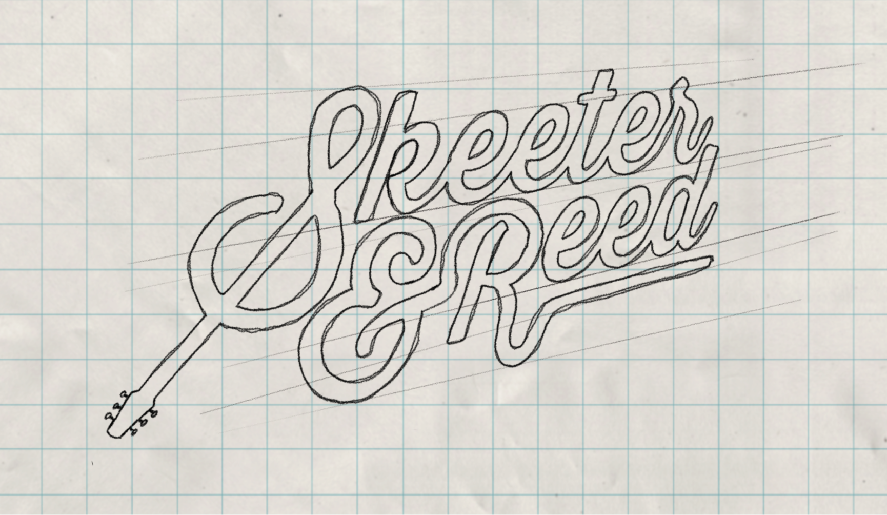
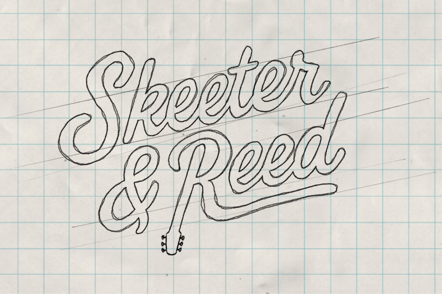
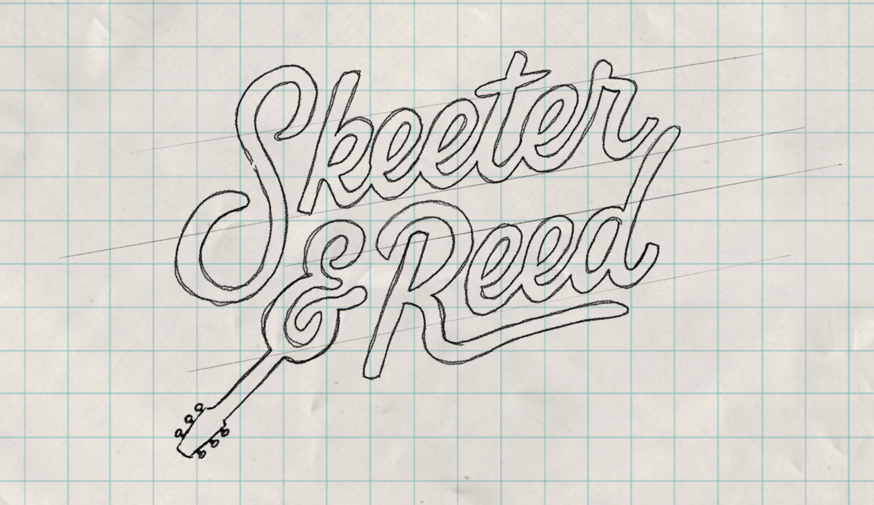
The identity began with pencil and paper, exploring how a guitar shape could naturally integrate into the lettering without feeling forced or gimmicky.
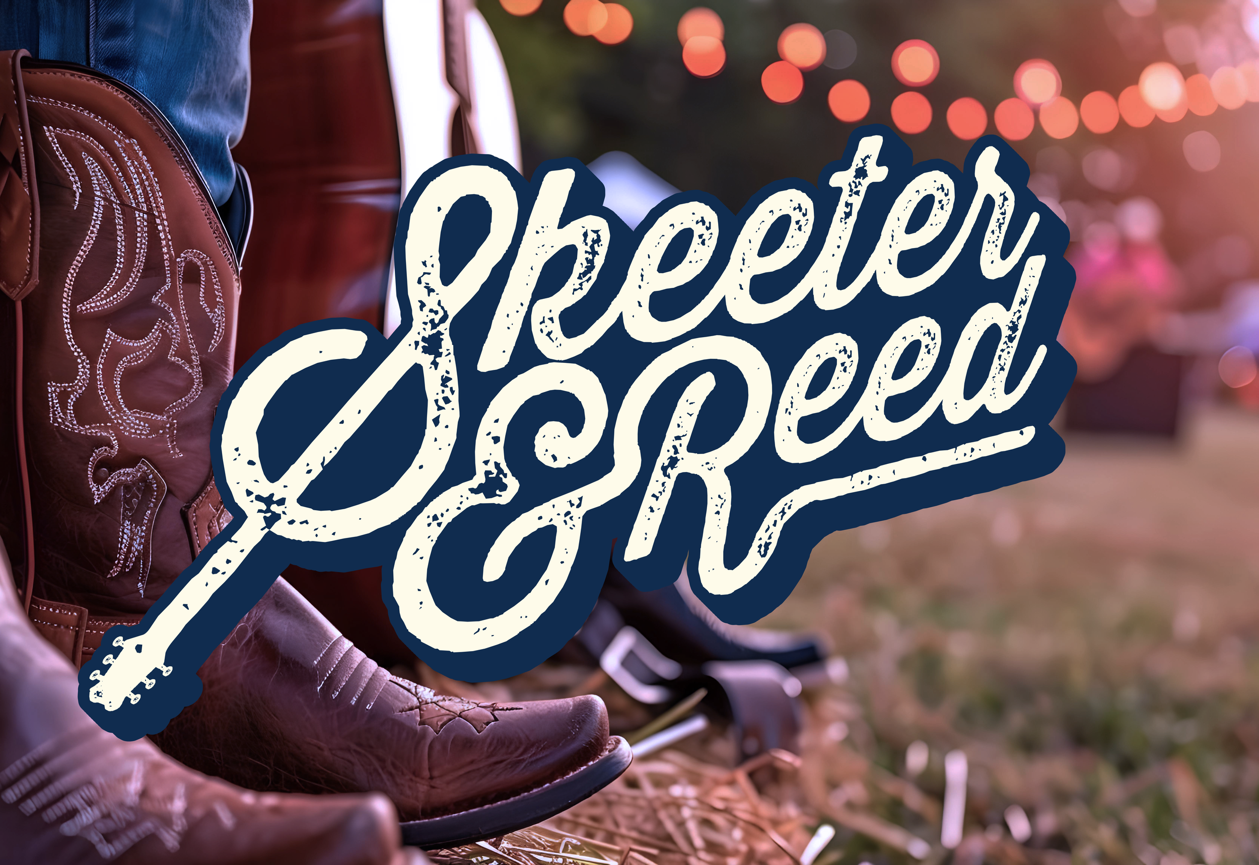
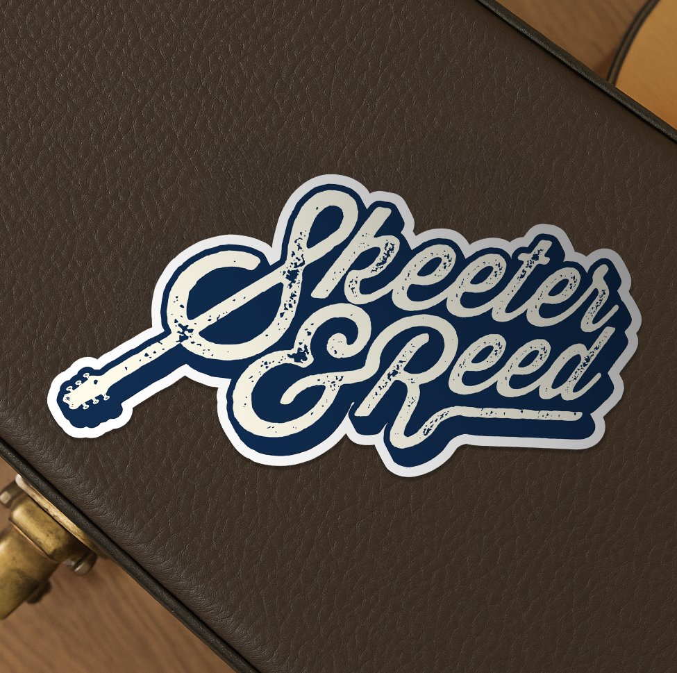
Early concepts experimented with incorporating the guitar into the ampersand and the “R.” Through iteration, the most balanced and iconic solution emerged within the “S” of Skeeter — where the curve subtly transforms into a guitar body and neck.
This integration creates a visual metaphor for harmony and collaboration, embedding their craft directly into the typography.
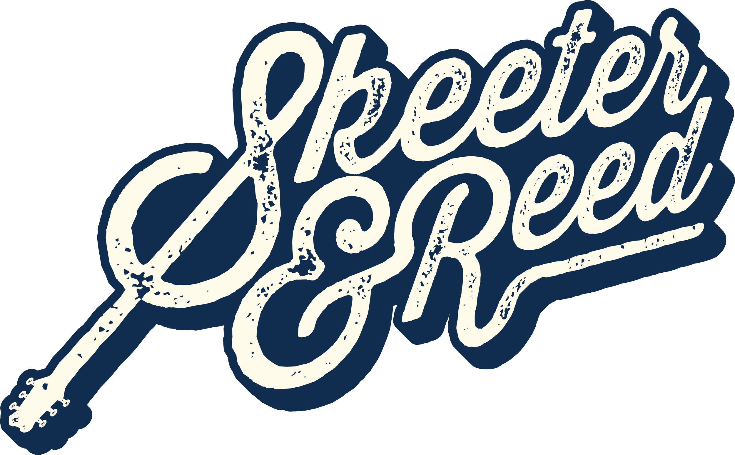
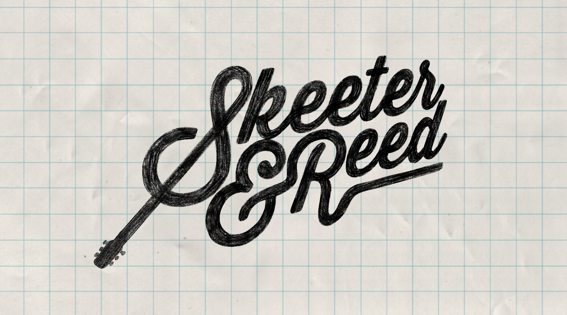
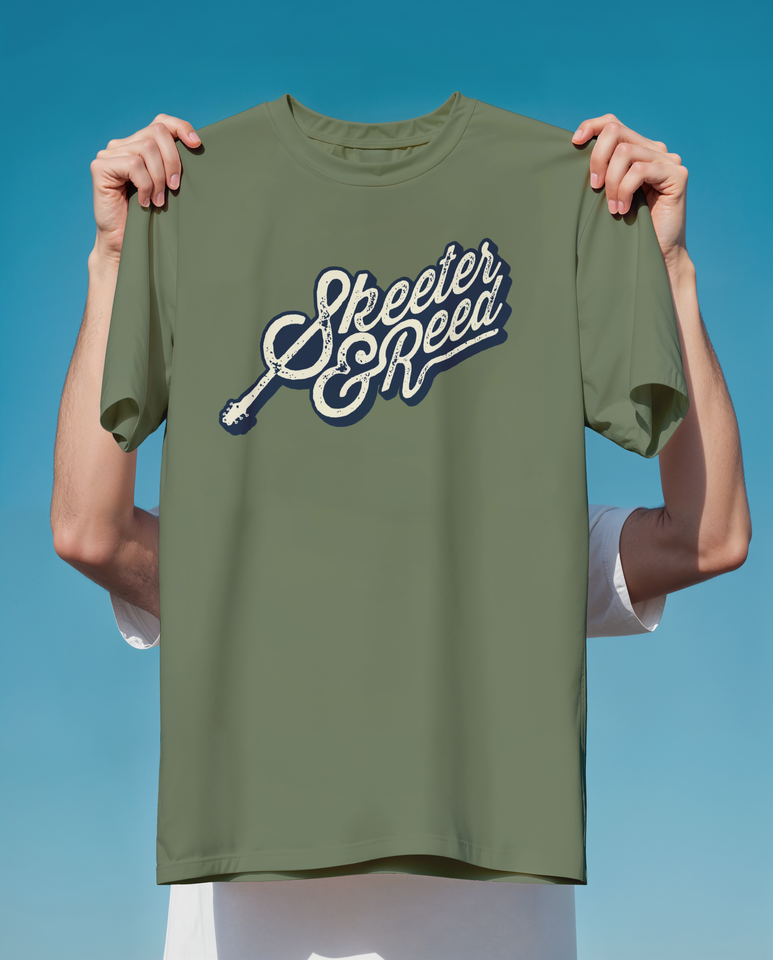
A custom wordmark built from Thirsty Script and refined to create a distinctive, music-inspired identity. Letterforms were adjusted for rhythm and balance, with the guitar seamlessly integrated into the “S” to reflect harmony and collaboration.
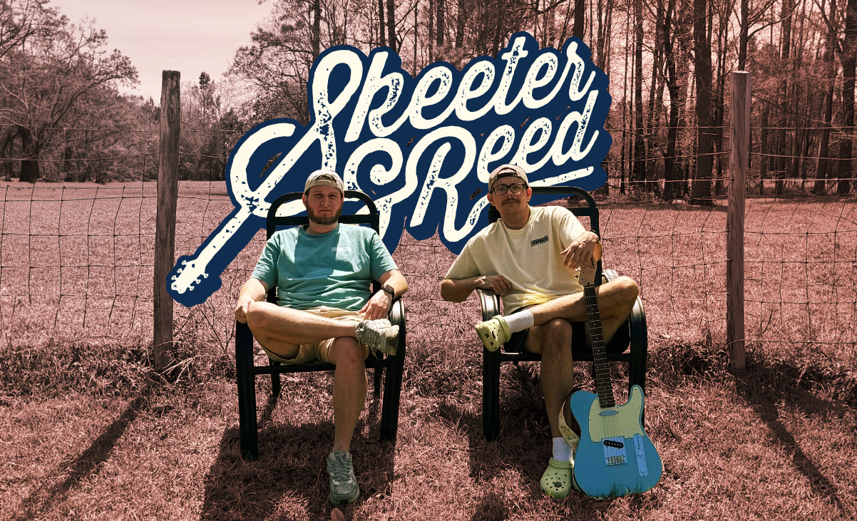
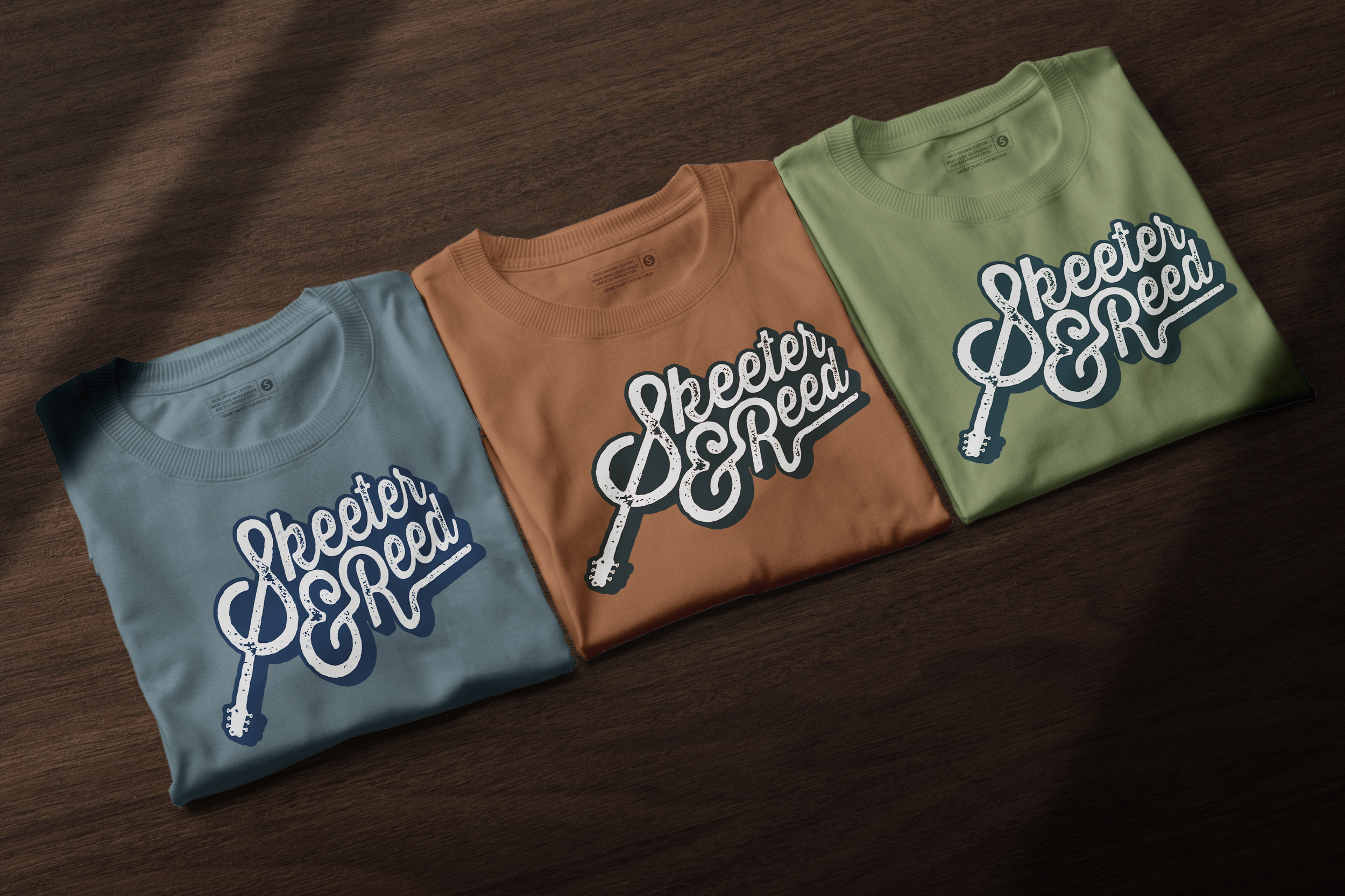
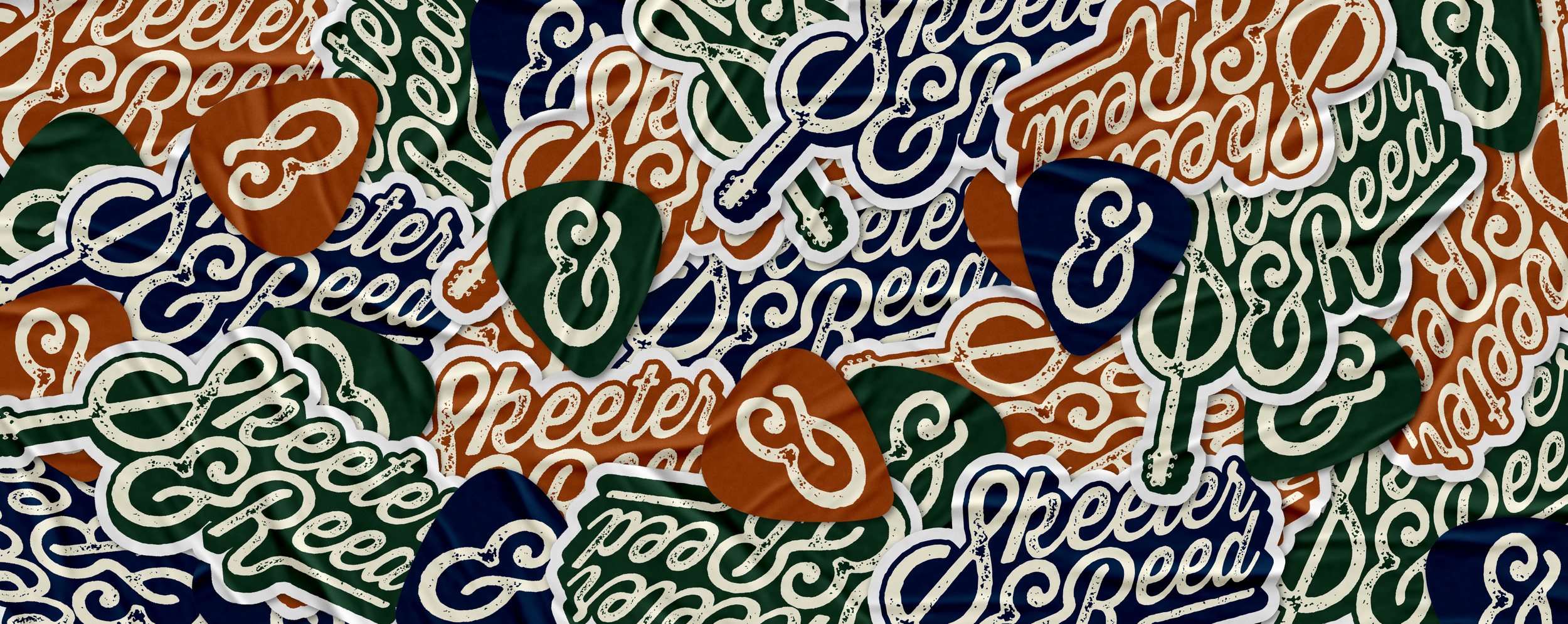
A warm palette inspired by vintage Americana anchors the system, ensuring flexibility across merchandise, digital platforms, and live promotion.
Visual Identity

impact
The final identity captures Skeeter & Reed’s easygoing Southern spirit while providing a distinctive mark that scales across merchandise, album artwork, and live promotion.
This project strengthened my ability to balance storytelling with restraint, ensuring the guitar integration felt intentional rather than decorative. Custom lettering allows me to shape meaning through form, and this identity reflects how thoughtful details can transform a logo into something personal and lasting.