
Rafael Flooring Company
Building a grounded, trustworthy identity for a Gulf Coast flooring business.
industry
Home Services / Remodeling
type
Client-Initiated, Self-Directed Execution
scope
Brand Identity, Logo System, Visual Guidelines
The Challenge
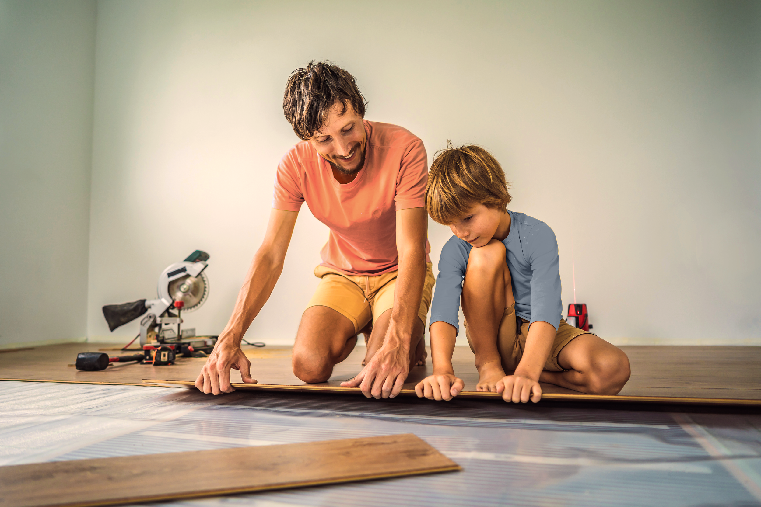
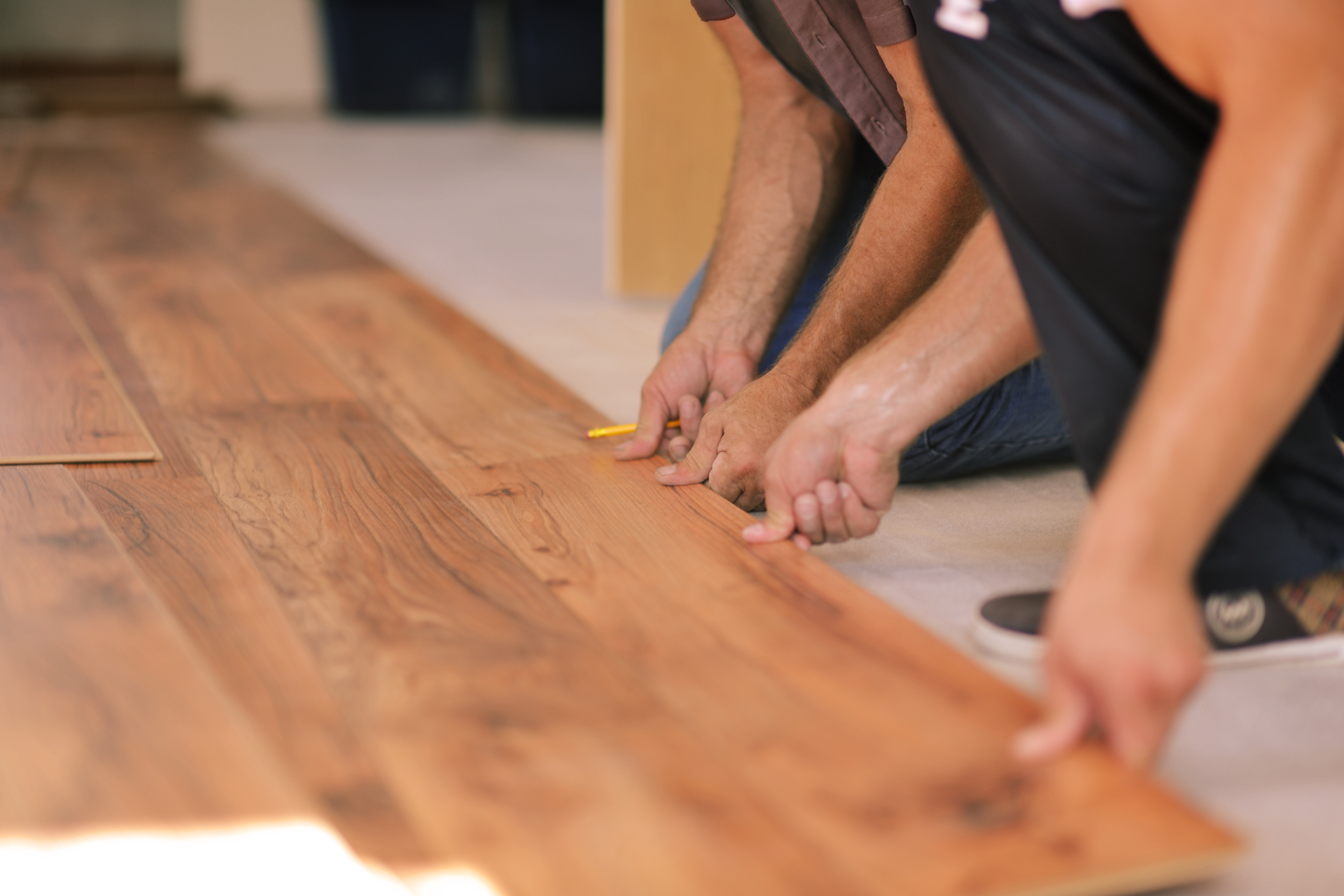
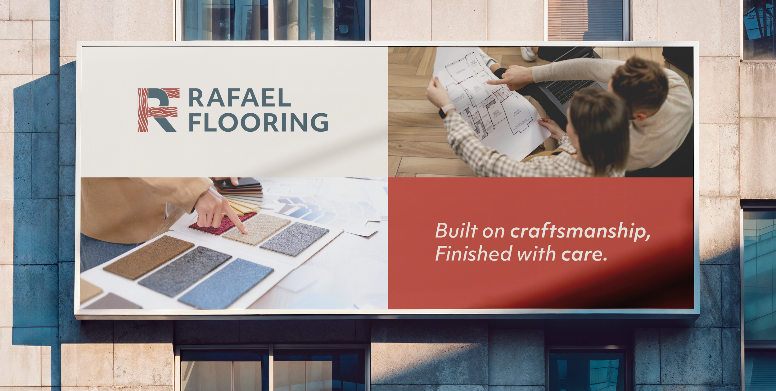
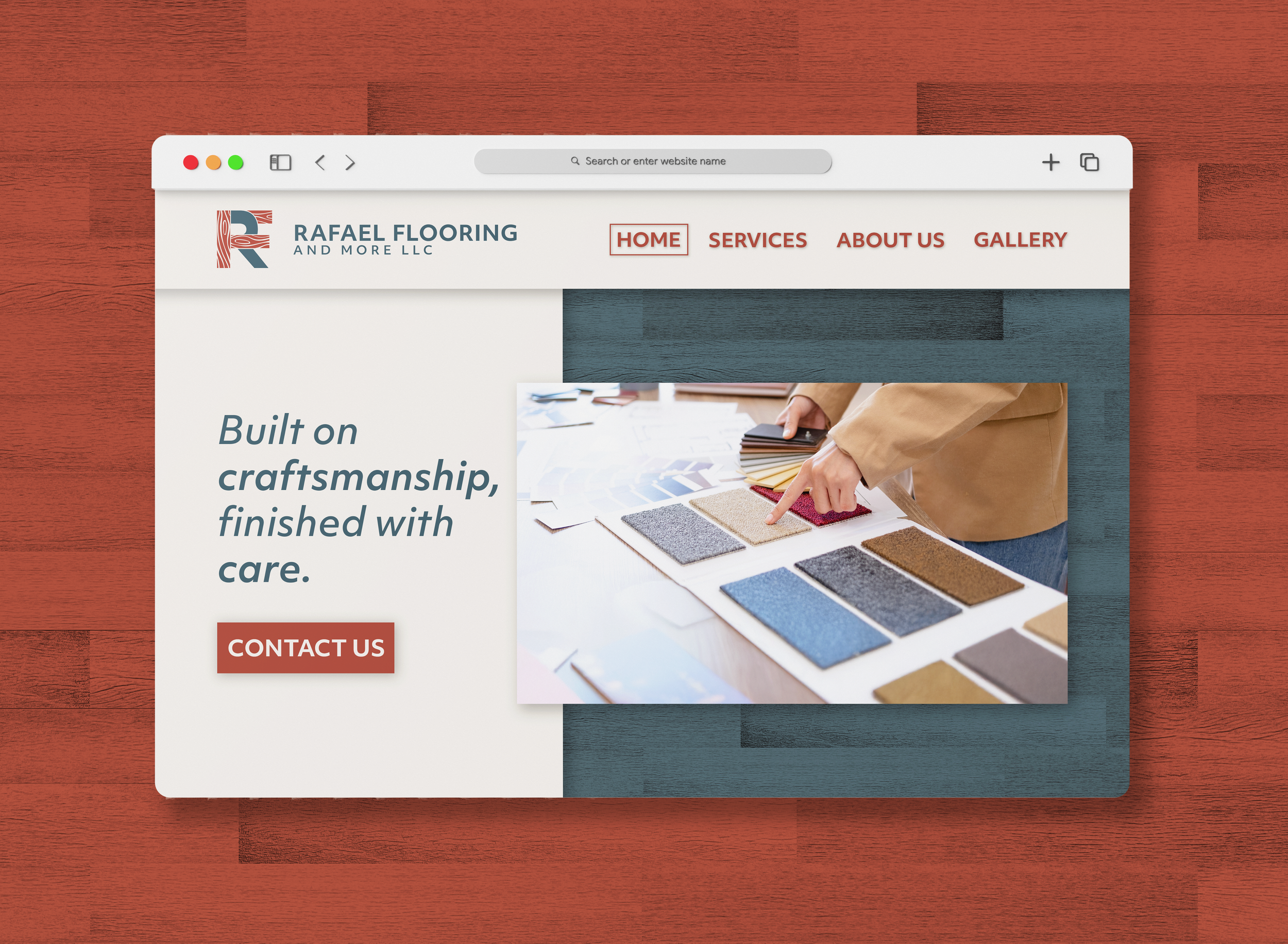
Rafael Flooring Company is a family-run remodeling business serving the Mississippi Gulf Coast. Built on craftsmanship and word-of-mouth trust, the brand needed to feel dependable and professional without feeling corporate or over-designed.
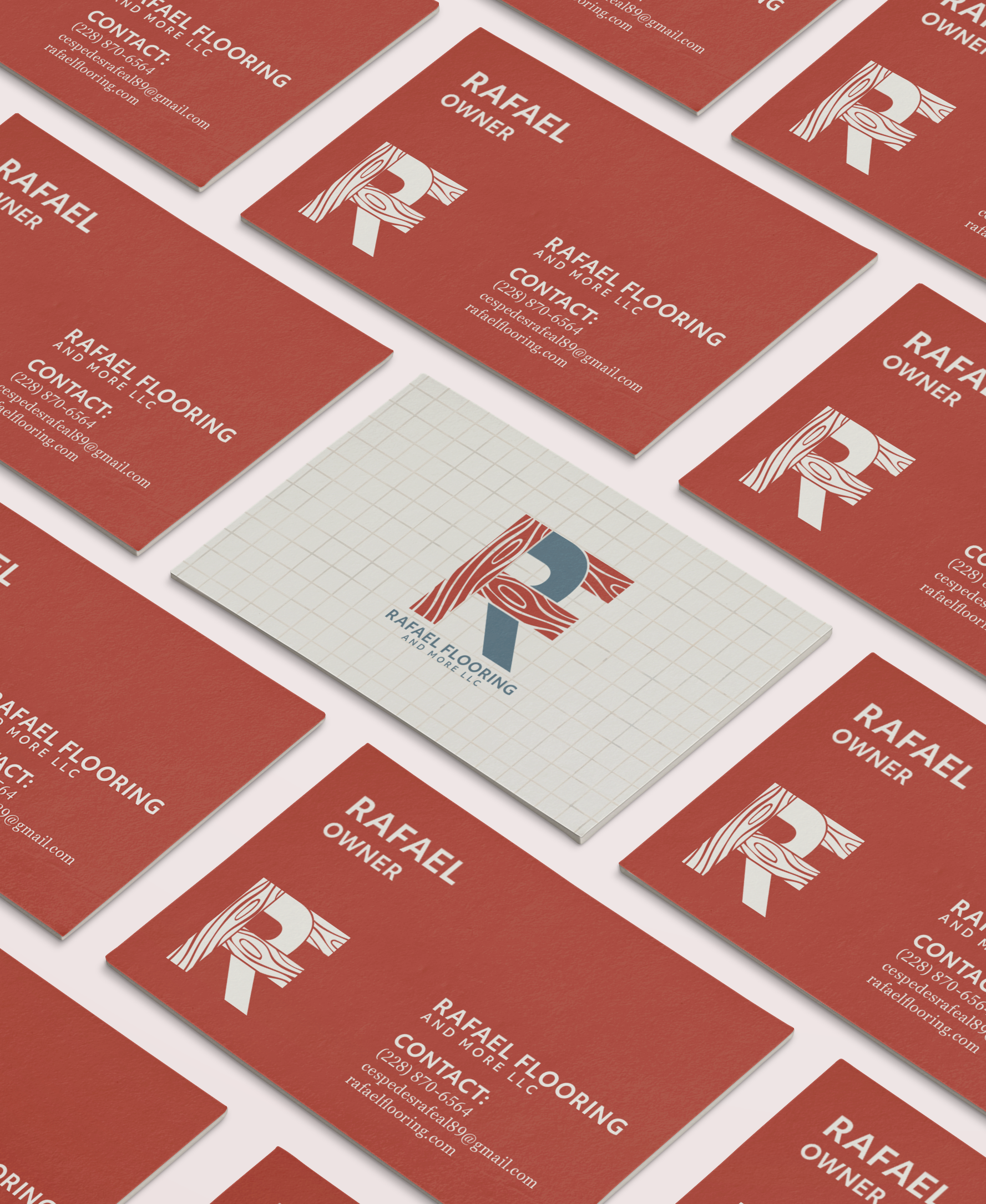
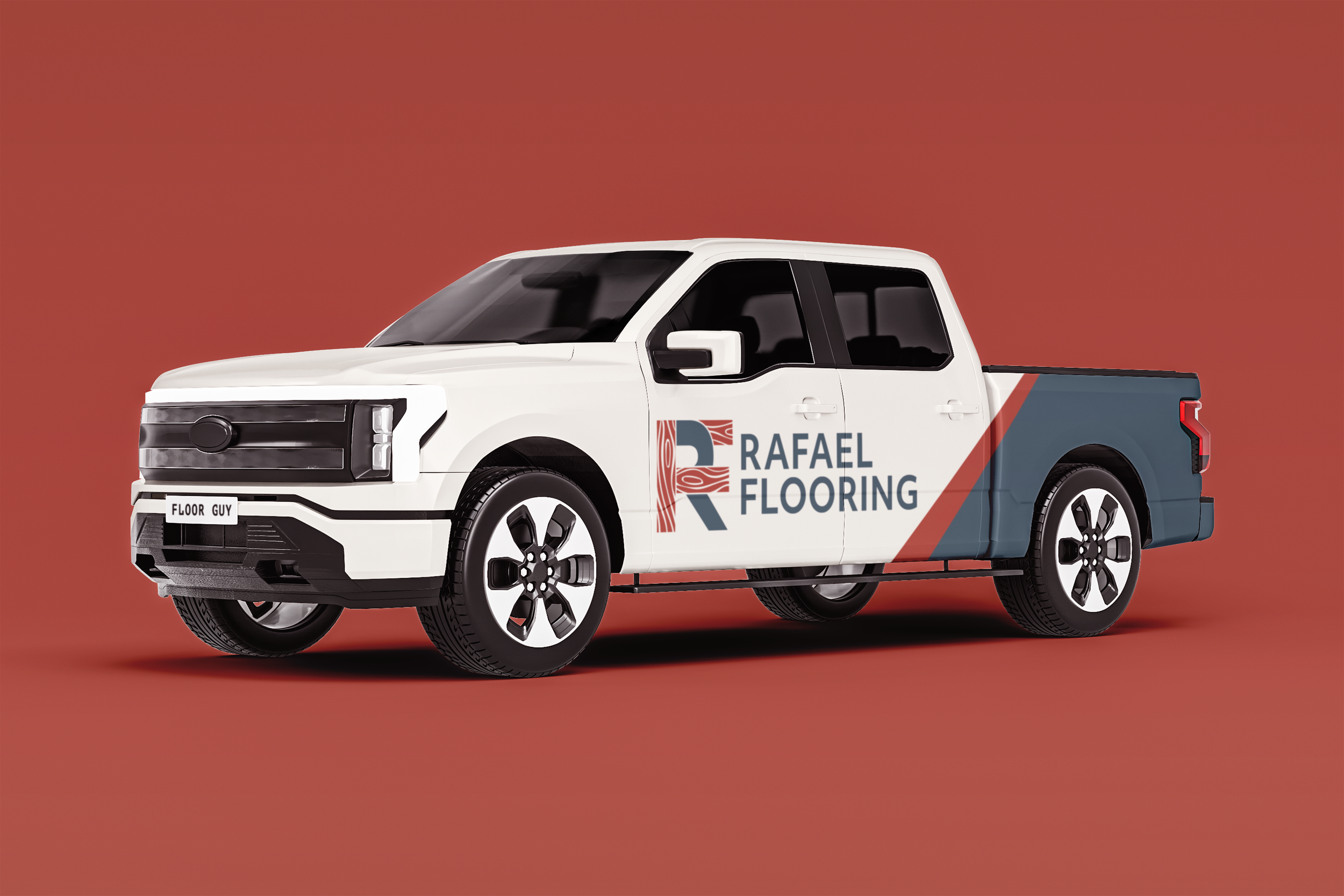
The identity had to work everywhere, from truck decals and uniforms to invoices and digital platforms. All while remaining simple, recognizable, and easy to apply.
Brand direction
Rafael Flooring Company is a family-run remodeling business serving the Mississippi Gulf Coast. Built on craftsmanship and word-of-mouth trust, the brand needed to feel dependable and professional without feeling corporate or over-designed.
The identity had to work everywhere, from truck decals and uniforms to invoices and digital platforms. All while remaining simple, recognizable, and easy to apply.
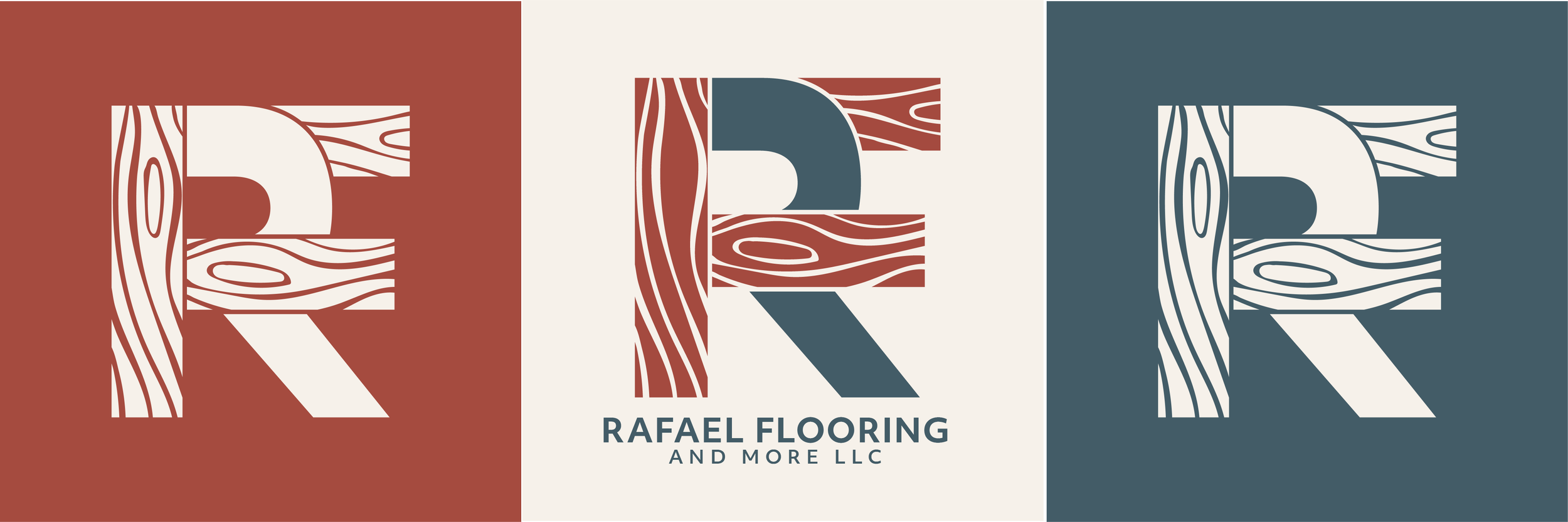
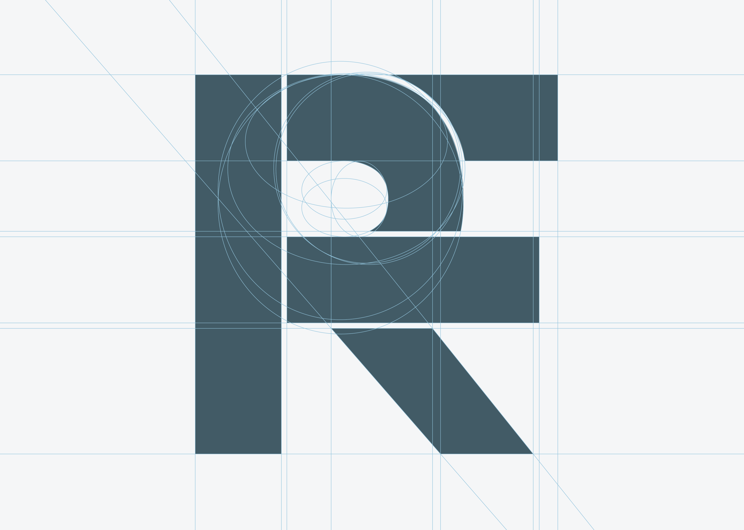
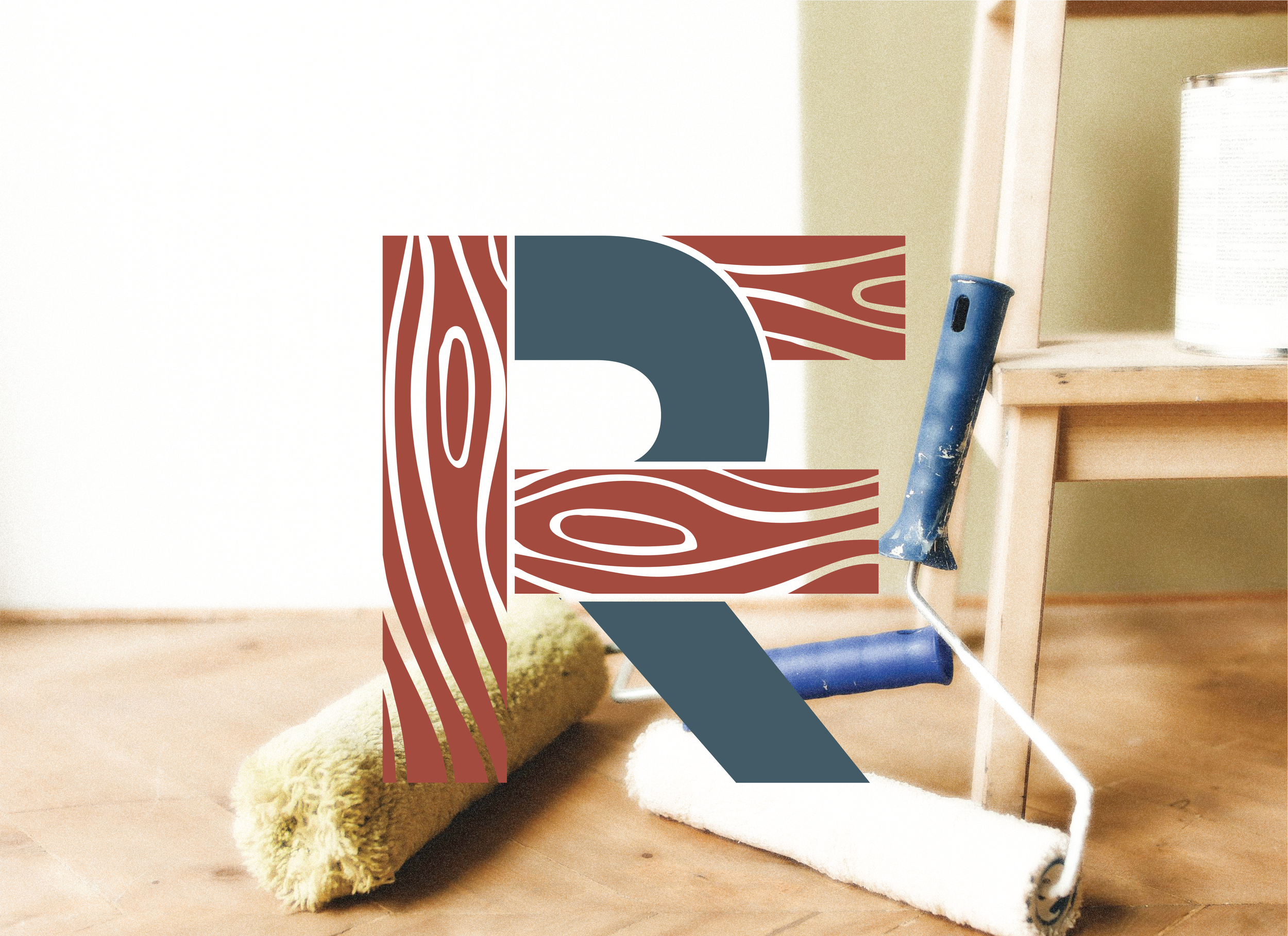
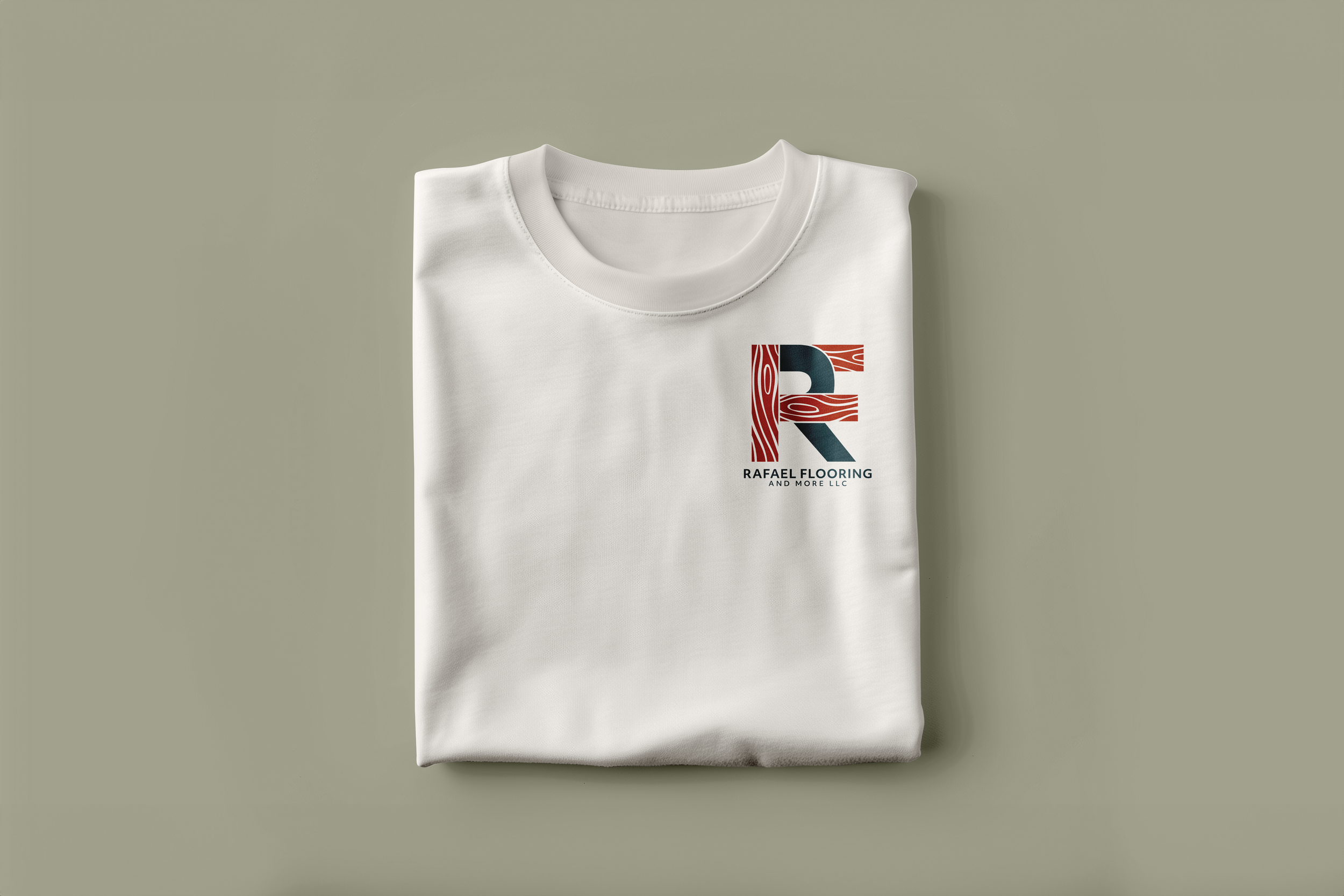
At the center of the identity is a woodgrain-inspired “R” designed to function both as a primary logo and a standalone brand mark.
The full wordmark supports formal applications like signage and print materials, while the standalone mark provides flexibility for apparel, decals, and social media — ensuring recognition at any scale.

logo system
COLORS & TYPOGRAPHY
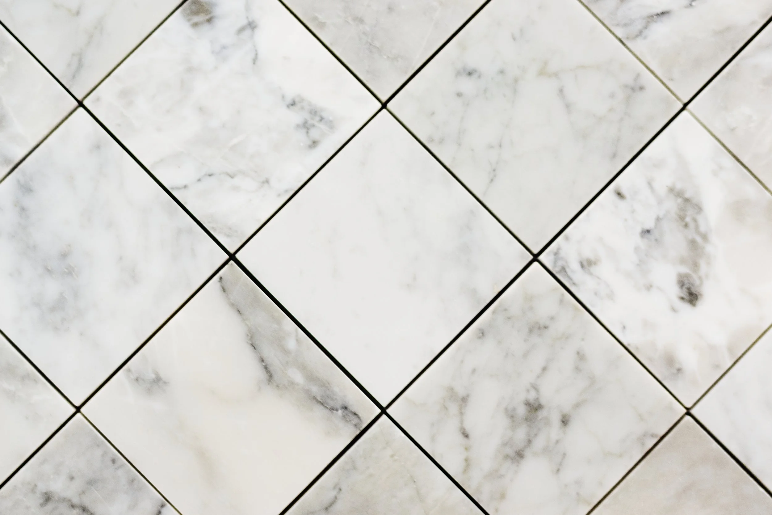
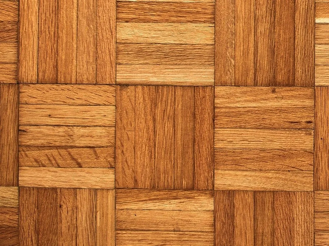
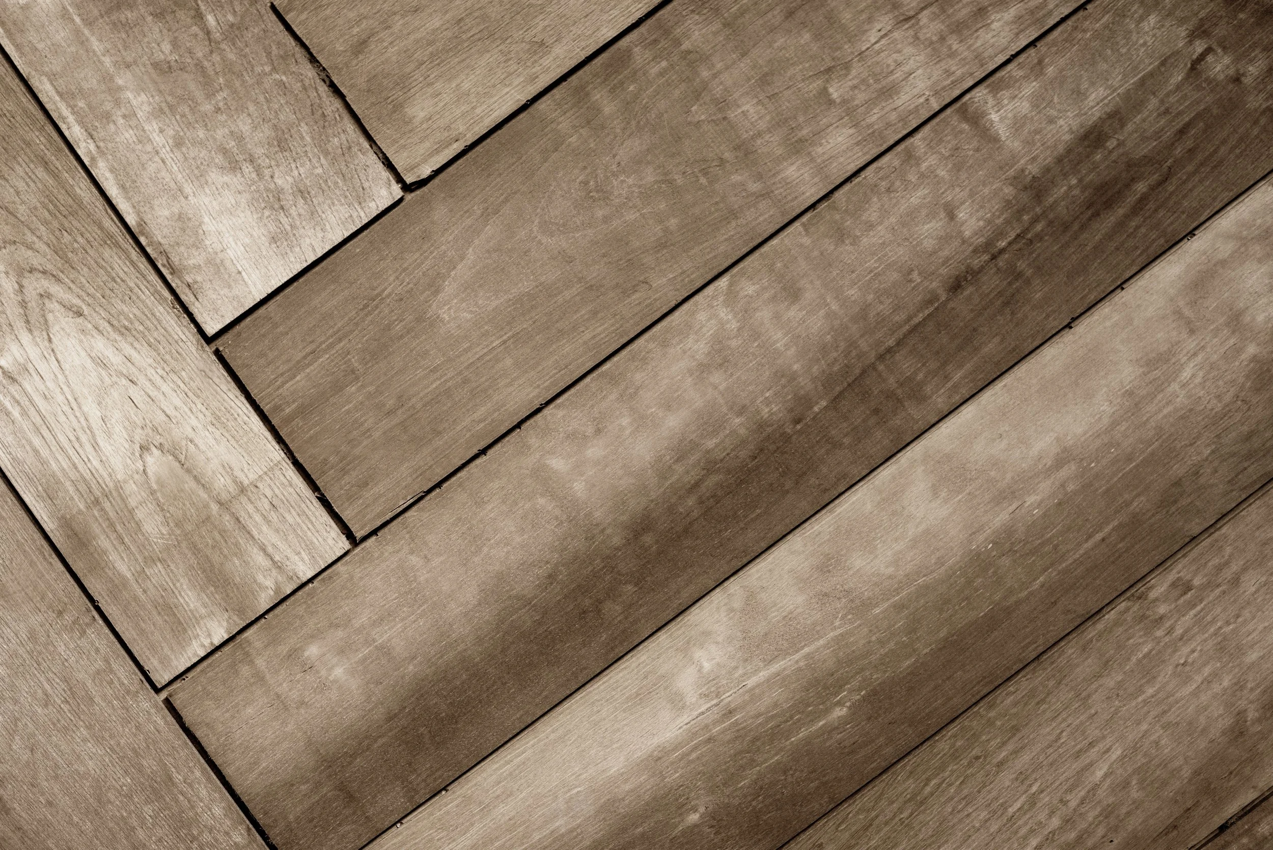
An earthy, elevated color palette draws from hardwood and natural materials — reinforcing durability and craft.
Typography is built entirely around Objektiv VF to maintain consistency and clarity across applications. All-caps bold headlines create strong visual presence for signage and decals, while bold subheaders and regular body copy establish a clear, practical hierarchy.
Using a single type system ensures the brand remains cohesive, legible, and easy to implement across print and digital touchpoints.
Coastal Quarry
#435C67
FIRED CLAY
#A54B3F
DRIFTWOOD SAGE
#B7B7A4
LIMESTONE IVORY
#F6F1EA
WALNUT BEAM
#6F4F38
Impact
The final identity provides a cohesive, adaptable foundation designed for real-world use. From truck decals to digital touchpoints, the system reinforces trust, professionalism, and consistency across every interaction.
This project reinforced the importance of balancing expression with practicality. For service-based businesses, clarity and usability matter just as much as visual personality.
Strong design doesn’t need to be loud… It needs to feel solid, reliable, and built to last.